.png)
Heali AI
User Research


Overview
In summer 2020, I worked as a UX research intern at Heali AI, where I worked closely with, designers, developers, and other researchers on Heali Beta App.
My main responsibility for this role included user study, usability testing, and questionnaire design. Before we launched the product, we had an 8-week user behavior study to improve the general product using experience.

Time
3 months

Role
UX Researcher

Final Deliverables
Usability Report
Design Suggestions

Problem
.png)
However, users didn’t use the scan feature as frequently as we expected. Some of the users mentioned that the scan feature is interesting, but it is not that "stable" and hard to use.
Research
.png)
"It's so sloooooooow!"
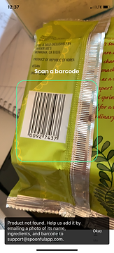
When asked about why they thought the scan feature was unstable, one of the interviewees mentioned that compared with another similar application, Spoonful, it seemed like the Heali app needs longer time to work.
Assumption 1

Is this a tech-related issue?
First I wanted to see if this was a tech-related issue. Maybe the package materials or texture made it hard to scan.
So I tried scanning 6 different types of packaging (as you can see in the picture) with both apps to see if there was a difference in the responding time.

And the answer is - No.
Although in general the responding time for different type of packages were different, the average responding time of the two apps were almost the same.
With that being said, it is true that some packages may be more difficult to scan, but that's not the reason why our users felt the Heali app were slower than the Spoonful app.
App
Average Responding Time

6.4 Seconds
5.1 Seconds


Assumption 2
Is it because of the way people use it?
Since I used the Heali app a lot, I was already very familiar with the scan feature. However, our users were not, and there were possibilities that they used the scan feature in a different way.
As a result, I decided to conduct a simple user testing with 5 friends to observe how they use the scan feature.
.png)
X5
Participants

Methodology
Task: Use Heali App to scan 2 products.
Device: Mobile (IOS)
Measurement:
Task completion time; Facial expression; Remarks & Body languages
Post-Session Interview Question Sample:
1. How was your overall experience with the scan feature?
2. Do you come across any problems or troubles when you are trying to scan the product?
Background

Heali AI is a mobile application which allows users with special dietary preference to view ingredient information by scanning or searching specific product.


The main feature of the app - the Scan feature - enables users to scan a menu or product barcode for ingredient nutrient information using AR(Augmented Reality) and machine learning.
Outcome and Observation

On average, new users spent 5 more seconds on Heali App to scan product

Why did users spend more time on Heali App?
During the process, they spent a lot of time positioning their phone.
The device needed to be in the right position in order to correctly scan. But there was a lag before the user got the response - it took a while for the app to process the image and pull the data out.

Wrong Angle

Too Far

Right Position
Users needed to hold the device for a second in the right position in order to see the scan result. During this period, if the user moved their phone, the app would restart this process again.
However, since the user didn’t know this, they would frequently change the position of their device thinking that they were holding the device incorrectly since they didn’t get an instant result.

Why didn't spoonful have this problem?
Once the user had the phone in the correct position, the border around the scan box turned green. This worked as a indicator to let the user know that their device was actually in the right place, and they didn’t need to change the position.
Apart from that, the spoonful app had larger scan area which makes it more visible to the users.


Design Suggestions
![Screen [CHANGE ME].png](https://static.wixstatic.com/media/2161e9_7ff04c71f18b4bf295cb13a20957fb3e~mv2.png/v1/fill/w_219,h_489,al_c,q_85,usm_0.66_1.00_0.01,enc_avif,quality_auto/Screen%20%5BCHANGE%20ME%5D.png)
-
Enlarge the notification box and the font size to make the scan results more visible
-
Need clearer instruction like "position product barcode here."
-
Make the scan area more visible (larger scan area or stronger contrast)
-
Add indicators (change border color or incorporate sound effects) to alert users when they position the bar code correctly.
-
Clearer instructions to notify users that they can either scan a product barcode or scan a menu.
-
Could have another separate interface for scanning menu feature.
Result
Final Design
I reported the results of my study to the product team, and suggested that we should have some indicators to notify the users when the device is at the right position. The tech team changed this feature based on my suggestion.
Validation
Later on, we ran a usability testing with the new interface. Both the task completion time and task success rate was higher than the previous interface. After the Heali app was launched, it received a lot of positive feedbacks from the users who really like the scan feature.

Menu scan feature is awesome the menu scan feature actually works really well and is super easy to use. A much better implementation than other attempts at this I've seen. It's fun to click and discover more about ingredients I don't know. I was even curious to see if it could be used on things other than menus, like ingredients on nutrition labels and it can. Super impressive!
Final Thoughts
The experience of working as a UX researcher at Heali makes me understand that sometimes UX designs can help solve tech problems in a more affordable way. And sometimes, what the users said may not be the real cause of a problem. In order to seek the truth, we need to be more careful about our conjectures and pay more attention to details when analyzing research results.